How to Build an Atomic Orbital Animation with HTML and CSS
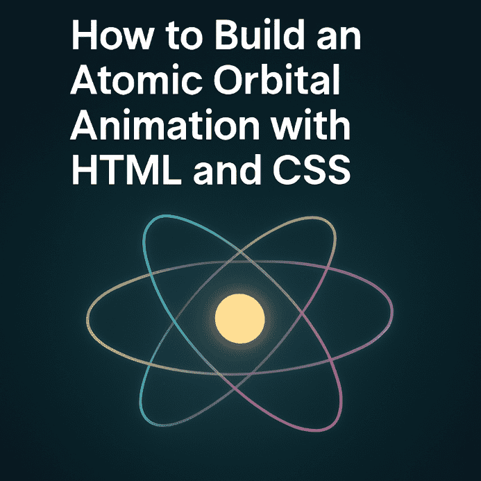
An atomic animation created with HTML and CSS is a creative way to simulate electrons orbiting a nucleus, ideal for interactive backgrounds, educational content, or striking visual intros. By combining 3D transformations and CSS animations, pastel-colored circles can orbit around a fixed center, producing a captivating effect.
HTML Structure
The markup is clean and modular:
- A main container with the class
.ib-bgthat defines the animation space - A centered wrapper
.ib-wrapperwith relative positioning - 11 orbital circles created using
.ib-circledivs, each animated individually
All circles share the same center point and use CSS rotations to simulate orbital motion.
CSS Logic: Orbital Animations
- Each circle starts at the center using
translate(-50%, -50%) - Rotation is handled via
rotateX(),rotateY(),rotateZ(), and combinations thereof @keyframesdefine unique animated trajectoriesanimation-delaystaggers the motion, creating a more natural desynchronization
The animations leverage 3D transforms and are supported across most modern browsers.
Design and Visual Customization
Visual appeal is achieved through:
- Pastel circle colors defined via CSS variables (
:root) - Soft blur applied to the background using
backdrop-filter - Lower opacity for a cinematic effect
- Thin borders of
4pxfor subtle visibility
Each circle follows its own trajectory, but all rotate around a common center — simulating a coherent atomic model.
Responsiveness and Extensibility
- Responsive sizing using dynamic units (
vw,vh) - Media queries enable adaptation on mobile devices
- Can be extended with a glowing nucleus or interactive effects
The animation can easily be modularized into reusable CSS components or dynamic backgrounds.
Conclusion
The atomic model animation with CSS orbital circles showcases the expressive power of 3D transformations and smooth motion. It’s a stylish solution built entirely with HTML and CSS, without relying on external libraries or JavaScript. Perfect for developers looking to craft an elegant and educational visual element. Download archive


Be the first to comment!